The Spice creamery branding
The Spice Creamery is a branding project that I completed. I worked on all aspects of the brand, starting from an organization proposal, all the way up to a fully developed brand guideline booklet. I created all brand rules for color, typography, logo usage, and photography rules. I also crafted a secondary logo system that was incorporated into a brand pattern. For the last portion of the project I located a nearby building to rebrand for this organization, both the interior and exterior.


brand identity
There are a lot of aspects to this project but they were broken down into digestible chunks in a way that is cohesive. The beginning of this project was spent researching potential customers and competitors. I also outlined a set of values and purpose for the organization. After doing so, I began work on creating a logo. I gathered inspiration online and began sketching some ideas. Through feedback, I was able to narrow down the final direction and begin the creation process. This logo was especially fun because this is the first hand-lettered logo I have completed. I wanted the logo to really have some personality to it, since the brand has such a distinctive personality. I think I was able to capture that well with the fun type and color system. I was able to find some really great typefaces that play well off of each other, with one being very decorative and the other being very clean. The color palette was chosen to represent creativity, generosity, and excitement. The red really brings out the excitement and creativity, whereas the dark green is indicative of generosity.


brand imagery
After establishing a brand voice and identity, I moved forward with creating additional brand imagery. This included creating a pattern from the secondary logo system, to be used on packaging and other background elements. I thought the pattern continued this idea of creativity and excitement by having interesting shapes that represent the ice cream. I also created photography rules, which focus in on the ice cream. I created a promotional poster to further explain this idea.


The building
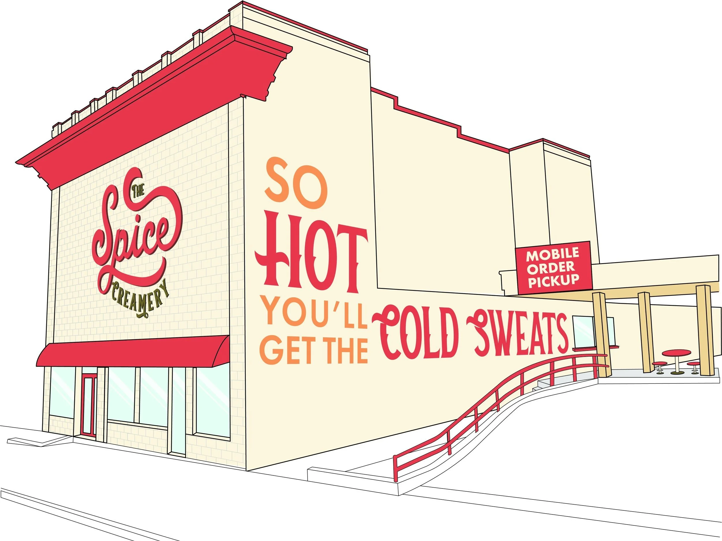
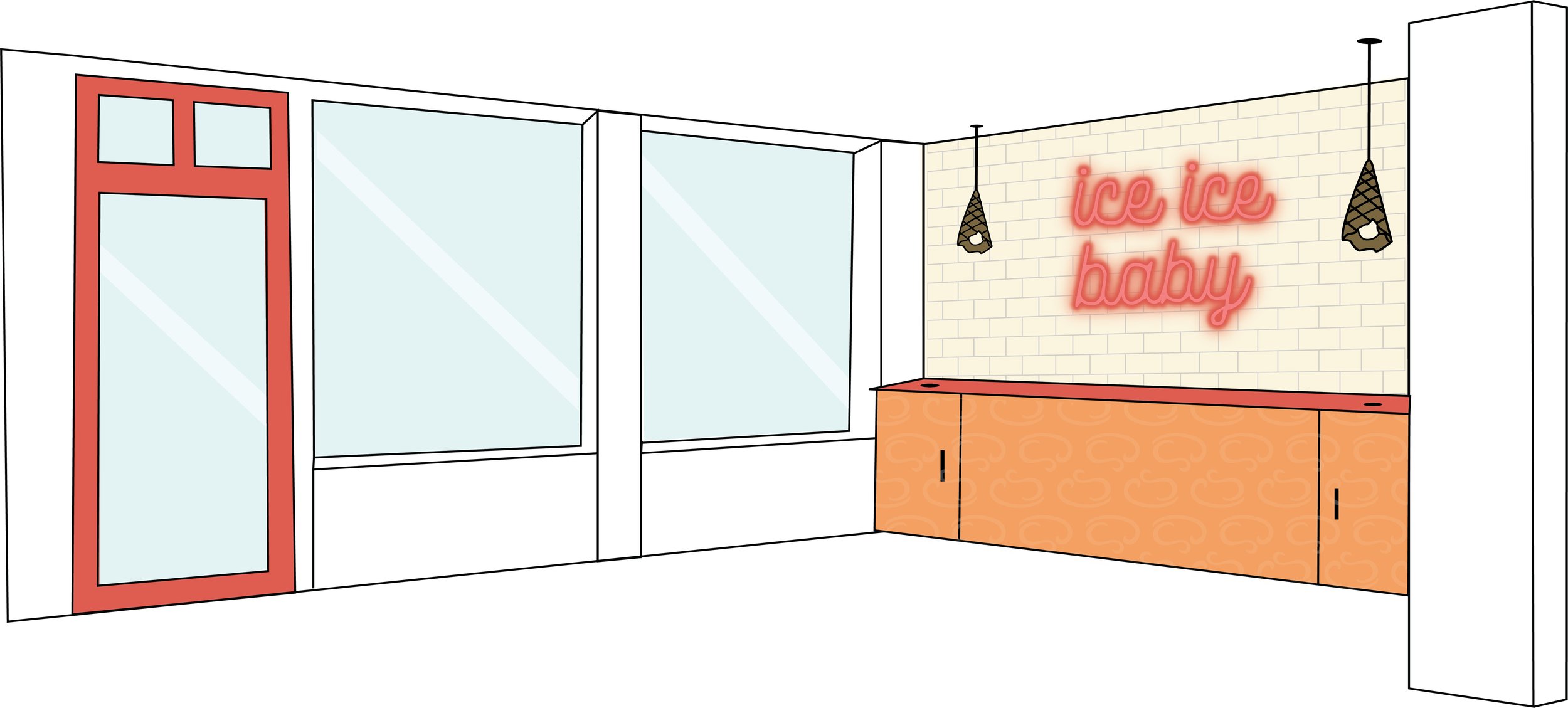
The last portion of this project involved finding a local building to rebrand for this organization. I found a nice building on main street that I decided would be perfect for The Spice Creamery. I took some creative liberties with the exterior, and decided to add a walk-up mobile order spot. I then used brand colors and imagery to help design this building to really make it match the brand values. One big thing I wanted to create was a “neon sign wall” which has become pretty popular for instagram photos. When outlining the audience, I discussed this being a place for young people to come and enjoy themselves. This neon sign wall specifically catered towards that audience in hopes to bring people in for the ice cream, and leave with photos that make them want to come back. One of the largest brand values is fostering creativity. There were a lot of blank walls available in this space, and I wanted to have some sort of interactive element to bring out that creativity in customers. This brought about the idea of large chalk walls, where customers have the opportunity to draw, write, create whatever is inspiring to them. I incorporated brand colors throughout the building, as well as, the brand pattern. I thought the pattern created more visual interest on the counters and added some textural elements too.
