Website for a Japanese-American fusion hibachi grill.
This was a project I completed for a Web design course. This is the website I built for a hypothetical hibachi-style restaurant. This restaurant features hibachi, as well as, Japanese-American fusion type dishes. The style I went for while designing this website was clean with pops of color, to resemble the attention to detail that goes into the food.
This website was designed and prototyped all within Adobe XD. You can clickthrough the final version yourself by using the button below!
Sketches and Sitemap
To start this process I created some sketches for the home page to get a feel of some different styles to see what seemed to work the best for this website. Once I completed these sketches, I had some peers look over them and I went forward with what most of them thought to be the best design. From there, I went on to make a simple site map showing the different links and what content would be displayed on those pages.


Wireframing
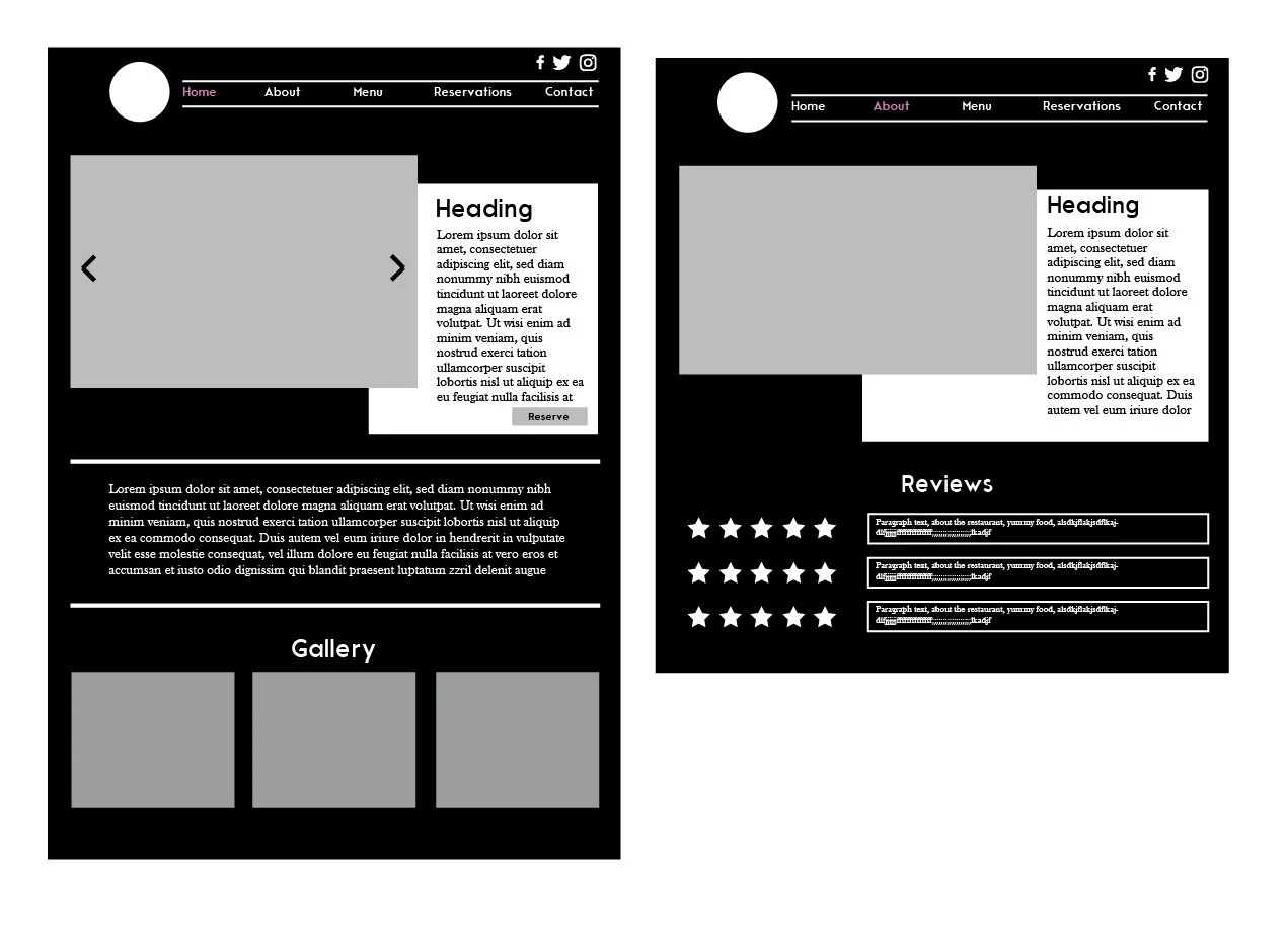
After completing the sitemap, I went on to make wireframes in Adobe Illustrator for each webpage I planned to create. While the final design is somewhat different from these wireframes, these were helpful in giving me a general layout of my content. It was also a quick way to mock up the look of the site, and after getting feedback from some peers, I moved on to my first prototype.


Prototyping
I spent a few weeks in the prototyping phase, where I spent my time building and fixing things based on feedback from my professor and peers. I gathered content such as the menu, and photos. I also created the logo, icons, and a custom map. Shown above is my first prototype. This is similar to my final design but I made some changes for functionality sake. I changed the menu to open when you click on the corresponding section, to help reduce clutter and make it easy to navigate. I also changed the “About” page, to have rollover features with images to organize information and make the paragraph small and easily digestible.
Below shows the features and design of the final website. I also designed mobile versions for this website. The mobile version is set up to be easy-to-use but still look as clean as the web version. I moved to a one-column layout (vs. three) and moved navigation to a hamburger menu.


