Design for a hypothetical Olympic games held in Athens, Greece in 2028.
In this project we were tasked with designing an iteration of the Olympics. I chose to design a summer games Olympics that would be hosted in Athens, Greece to be held in 2028. I chose Athens because I thought it would be a nice challenge to create a modern version of the birthplace of the Olympics. In this project, I was to design a logo, identity system, posters, icons, tickets, and other promotional signage.


Research and Sketches
Before I chose which city I wanted to design for the Olympics, I started by researching the event as a whole. I worked with a team of four other people to research major aspects of the Olympics and how they work. We researched the history, finances, technological developments, social media & digital innovation, and design. This was a great way to become extremely familiar with the process of hosting and designing an Olympic event. After this process, I began curating a mood board with visual language similar to what I wanted my Olympics to correlate with.
After creating a moodboard, I moved on to sketches and ideation. I wanted to go with a simple, clean, but strong design, something that is shown frequently in modern Greek architecture. I explored elements of modern design as well as some ancient elements that I felt could be modernized. This logo went through many changes. I wanted to really portray the idea of strength and beauty, which is an interesting juxtaposition. I decided that the image of a column was a great way to portray this idea, and it represents iconic Greek architecture.
Digital Sketches
My classmates and professor liked the idea of the columns and torch from my sketches, so I tried many different versions of that composition. I was really trying to find the balance between ancient and modern. After trying many versions in this style, I decided this direction wasn’t going to accomplish my original intentions. I decided to completely switch gears, the last 5 sketches reflect where that change happened. I felt that the simplified version of the column and the olive branches reflected traditional Greece while being portrayed in a clean and modern design. The final version of the logo is shown below, I’m really happy with where it ended up and that I was able to solve this visual problem.
Identity System
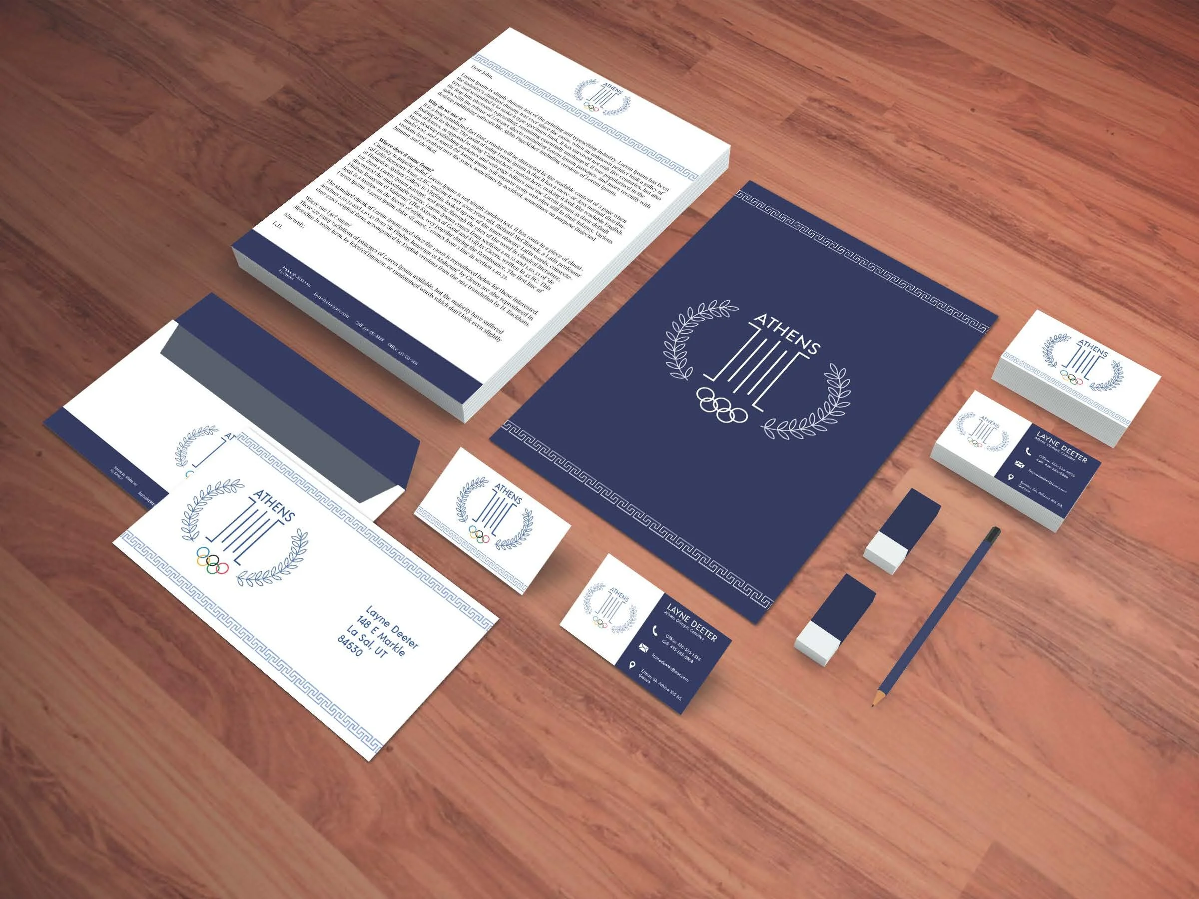
After finalizing the logo, I moved on to branding and creating a cohesive identity system. I wanted to play with some Greek borders throughout the rest of this project, and I started by bringing in this geometric pattern border. I wanted the identity to be simple and minimalistic, matching the style of the logo.
Other Branding Elements
Moving on from the Identity System, I was then to create posters, tickets, icons, webpage, and wayfinding signage. I took the idea of Greek borders and pushed it further by having changing borders on some of these branding elements - particularly the posters and tickets. I really like the way they play off each other while still looking like their own thing. Overall, I had tons of fun working on this project. Even though I had to wrestle with the logo for so long, I’m glad I stuck it through and created something that better reflects my intentions.


